Different types of charts, and their use – Heikin Ashi, Renko, Kagi, Point & Figure
Whether you are a fundamental or technical trader, you will likely agree that charting software is a useful addition to the trading toolbox. Traditional candlestick charts dominate the industry, but did you know there are many other charting types to use? In this article, we dive into the other popular chart types, what they do, and how you could use them to your advantage.
To prevent this article from getting out of hand, we focus on the chart types available on TradingView. TradingView is the most popular chart analysis software in crypto and many other markets. The tool offers a wide range of chart types:
- Bars
- Candlesticks
- Hollow Candlesticks
- Columns
- Line
- Area
- Baseline
- High-Low
- Heiking Ashi
- Renko
- Line Break
- Kagi
- Point & Figure
- Range
With so many charts to choose from, most traders never venture beyond one of the most common chart types: candlesticks – and for good reason! This powerful tool allows for extensive analysis, price action analysis and chart pattern study.
Nevertheless, it is worth exploring the most popular alternatives.
What is a Candlestick Chart?
First things first though, the most commonly used chart type - candlestick charts - has been around for hundreds of years. This chart type plots an assets price history by showing the open price, the highest and lowest price, as well as the lowest price, visualized in what is known as a candlestick, helping traders understand the emotion in the markets.
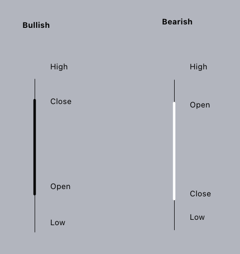
The bigger area between the open and close of a candlestick is called the body, representing the gain or loss during that day. The thin-pointed sticks of the candlestick are called shadows, or wicks, representing the price action that happened outside of the body of the candle.
Candlesticks are used by many traders and algorithms alike, because of their simplicity and the information it provides about the price history within a single candlestick.
What is a Line Chart?
Line charts are a simple visualization of an asset's price history, by drawing a line between closing prices for each specified period of time. For example, the weekly line chart will draw a continuous line between the prices at the end of each week; as you can see in the chart below (Gold Spot, Daily chart).
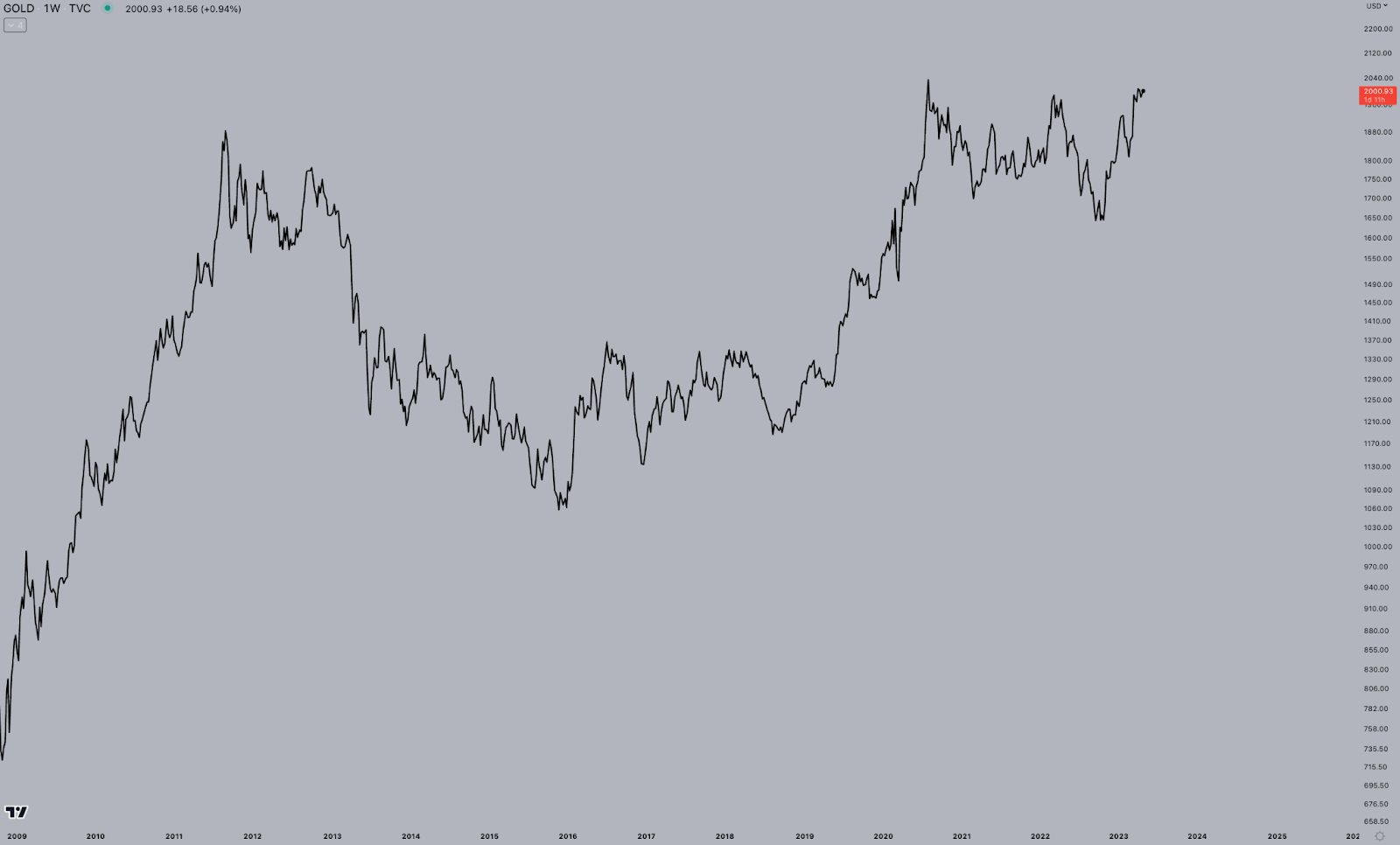
Because a line chart only uses closing prices, it reduces noise to a minimum. The volatility between open and closing prices is completely ignored, resulting in a simple view of support and resistance levels, trends, and chart patterns.
On the other hand, line charts do not provide enough information for many traders - who require more information on the high and low of each period. All in all, line charts are perfectly suited for a quick scan of the markets, or to re-consider one's bias - but likely too simplistic for a more extensive analysis.
What is a Heikin Ashi Chart?
Heikin Ashi is Japanese for "average bar". This chart type is a modification of the regular candlestick charts, meant to simplify trends and make charts easier to read.
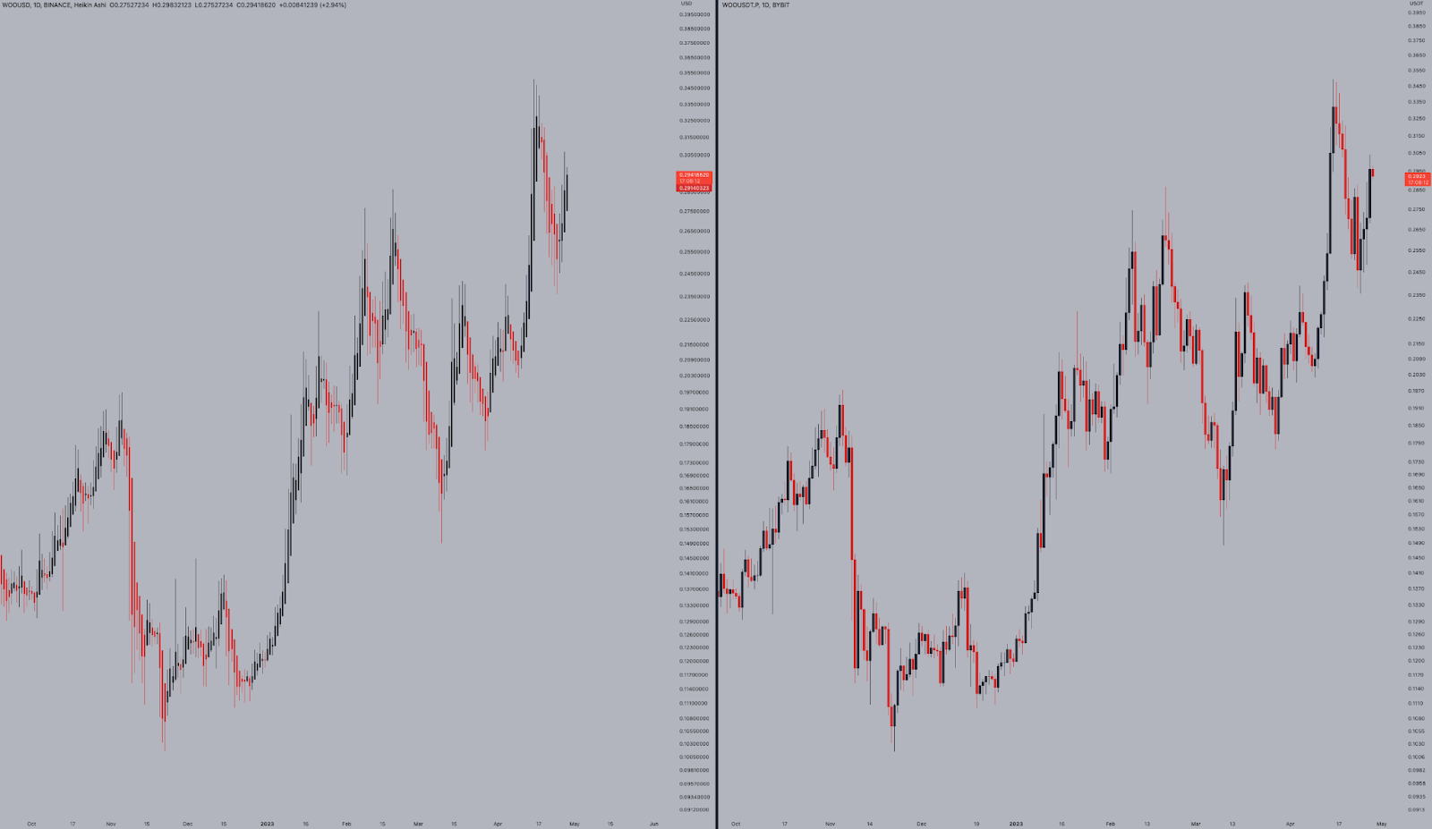
While regular candlesticks merely focus on the current price of an asset, Heikin Ashi charts display an average of the movement. As a result, candles generally stay red during a downtrend, and green during an uptrend. Trend traders generally enjoy the heikin ashi chart, as this characteristic makes it perfectly suited to show an ongoing trend, and when it changes.
Note that when using Heikin Ashi charts, the price displayed may be different from the trading price. The chart below shows a daily heikin ashi (left) and traditional candlesticks (right) chart of WOO / USD.
What is a Renko Chart?
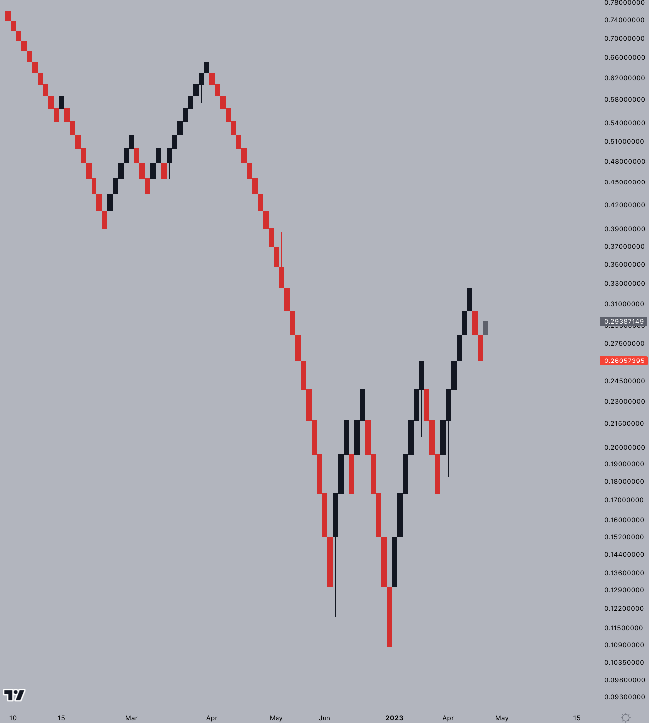
Renko is another Japanese chart type that plots prices merely by pre-set price movement, and does not consider the passage of time like other chart types. Its name is likely derived from the Japanese word for brick (Renga) because the chart strongly resembles a series of bricks.
A new brick is printed when the price moves a certain amount, which can take anywhere from a couple of minutes, to multiple weeks. Renko charts are again favoured by trend traders for their simplistic way of displaying trends, and when they end.
Its lack of consideration for the passage of time makes it overly simplistic for many traders, though. Moreover, Renko is based on closing prices, which means the price can whipsaw significantly without moving the Renko chart an inch. As such, Renko charts are often used in combination with other forms of analysis, and not on a stand-alone basis.
The chart below is a daily Renko chart of WOO / USD.
What is a Point and Figure Chart?
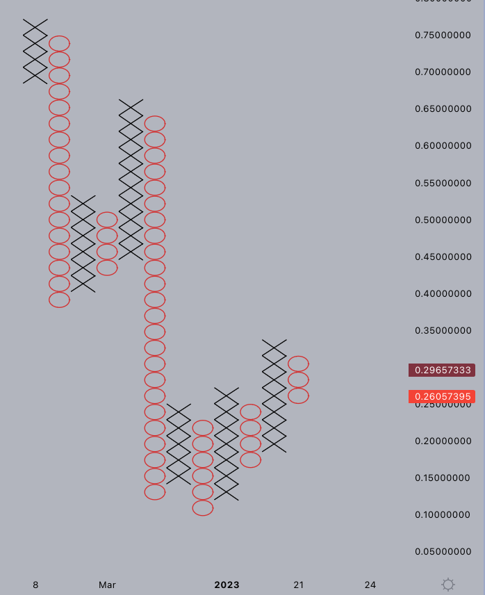
Point-and-figure charts are another charting technique that does not consider the passage of time. Similar to Renko, the point-and-figure charts only print a new data point when the price moves a certain amount (fixed by the user).
Point-and-Figure charts print columns of X's and O's stacked on top of each other - with each symbol representing the fixed price movement. The X shows an increase in prices, whereas the O illustrates a drop in prices.
As said, this charting type is very similar to Renko, with the primary difference being the way the chart looks. For this reason, Point-and-figure charts too are often overly simplistic for many traders, with the same lack of consideration for intra-candle volatility. As such, Point-and-figure charts are often used in combination with other forms of analysis, and not on a stand-alone basis.
The chart below shows the same daily WOO/USD chart, this time in Point-and-Figure style.
Other types of charts
There are many more charting styles, many of which have a similar purpose as the ones we discussed so far. For example, the Kagi and Range charts too are chart styles that do not consider the passage of time and only focus on price volatility. Area charts are similar to line charts, with the only difference being that the area below the line is colored in.
Conclusion
All in all, there are many different chart types that are suited for different analysis techniques. Traditional candlesticks and line charts are the most popular styles, while Renko, Heikin Ashi, and Point-and-Figure charts were developed to reduce the amount of noise on a chart, focussing on price movement instead.
Depending on your trading style, it may be worth exploring these styles to see if they can take your trading to the next level.
Writer’s Disclaimer: This article is based on my limited knowledge and experience. It has been written for educational purposes. It should not be construed as advice in any shape or form. Please do your own research.
Editor's note: CryptoJelleNL provides insights into the cryptocurrency industry. He has been actively participating in financial markets for over 5 years, primarily focusing on long-term investments in both the stock market and crypto. While he watches the returns of those investments roll in, he writes articles for multiple platforms. From now on, he will be contributing his insights for Alpha Circle as well.
Check out his twitter: twitter.com/cryptojellenl
—
The content above is neither a recommendation for investment and trading strategies nor does it constitute an investment offer, solicitation, or recommendation of any product or service. The content is for informational sharing purposes only. Anyone who makes or changes the investment decision based on the content shall undertake the result or loss by himself/herself.
The content of this document has been translated into different languages and shared throughout different platforms. In case of any discrepancy or inconsistency between different posts caused by mistranslations, the English version on our official website shall prevail.


